Livora Vitamins
Wellness packaging
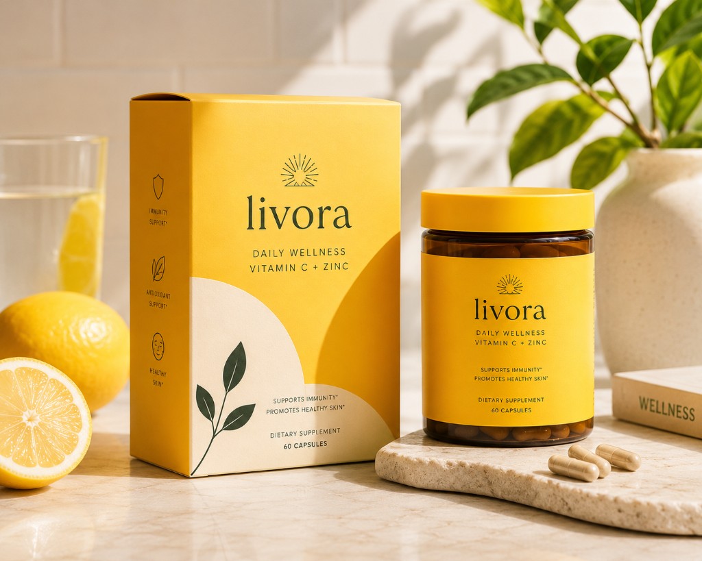
Supplement packaging for a wellness brand navigating the tension between clinical credibility and lifestyle appeal — designed to work in pharmacies and DTC equally.
Client
Livora
Role
Packaging designer
Year
2024
The challenge
Most supplement packaging falls into one of two failure modes: so clinical it feels like medicine, or so lifestyle-forward it feels untrustworthy. Livora needed both signals simultaneously — the kind of brand that a doctor wouldn't dismiss and a health-conscious 30-year-old would actually want on their kitchen counter. Regulatory information requirements also had to be incorporated without making the pack feel crowded.
The approach
I structured the information hierarchy in three clear tiers: brand identity at the top, product name and benefit claim in the middle, and regulatory detail at the base — each with distinct typographic treatment so the eye moves naturally from recognition to decision to trust. A fresh, saturated green palette was chosen specifically because it reads as 'health' without the pharmaceutical coldness of white and blue. The system was built across four SKUs with a consistent structure that allows the product range to be understood at a glance.

Project highlights
Information hierarchy built to meet regulatory requirements without visual clutter
Four-SKU system with consistent architecture and variant colour coding
Palette chosen to bridge clinical credibility and lifestyle warmth
Next project