aya. Body Butter
Skincare packaging
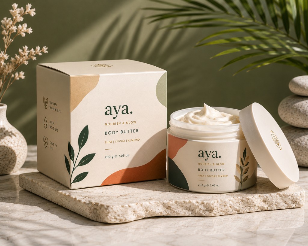
Packaging identity for a DTC skincare brand built around the idea that nourishment should feel unhurried — calm, botanical, and quietly considered.
Client
aya.
Role
Packaging designer
Year
2024
The challenge
aya. was targeting a skincare customer who is fatigued by overcrowded labels and aggressive wellness claims. The packaging needed to feel like a deliberate exhale — minimal without being cold, premium without being unattainable. The biggest tension was making something that read as luxurious while keeping the design genuinely simple rather than just sparse.
The approach
I stripped the layout down to its structural essentials — brand name, product name, weight. Everything else was removed. What remained was given room to breathe: generous margins, a soft sage and off-white palette, and a single hand-drawn botanical element that added warmth without adding noise. The label architecture was built as a system so new SKUs could be added consistently without redesign.

Project highlights
Label system designed to scale across multiple SKUs
Deliberately restrained layout — every element earns its place
Botanical illustration integrated as a system element, not decoration
Next project